Midterm
- giselaf
- Oct 30, 2019
- 1 min read
Updated: Nov 8, 2019
Answer the following on your blog (worth 20 points)
1. How did you use kerning, leading or tracking?
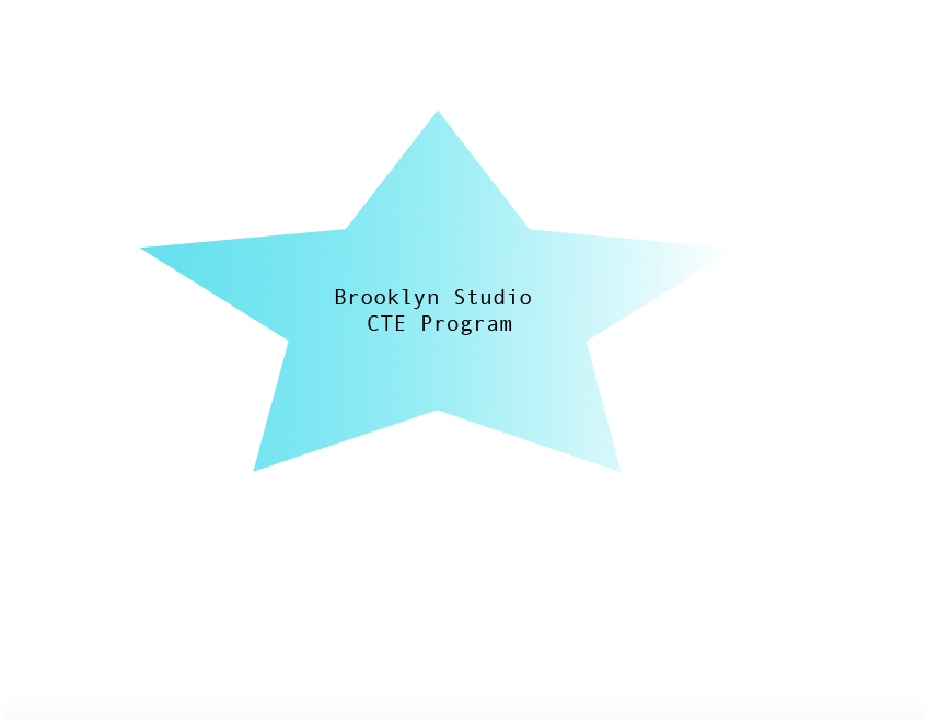
I used tracking to space everything out.
2. What font style, color scheme did you pick to represent the logo? Why?
I used Andale Mono as the front because it seemed very neat.
3. How did you animate the type to represent the Principles of Design? Be specific. How and why
did you change kerning, leading or tracking?
I changed the tracking to make everything more organized by giving space to the words/letters
4. List 5 ways you will take to make your document Print Ready.
* spell check
* organized
* neat
* color
* simple
5. List 5 differences between Adobe Illustrator and Photoshop when it comes to creating graphics.
* Photoshop creates a gif
*Photoshop uses pixels while illustrator uses vectors
*Organizing elements is easier in photoshop becuase of the layers
*Illustrator creates a easier logo design
*Text quality layout and creation is more complex in illustrator.


Comments